How this brand is built
The mark, the palette, the type and the motion - written down so the next page, poster or partner post looks like it came from the same mountain.
The brand in one page
Everything below is enforced in code, not aspiration. The palette, the type scale and the motion timings are single-source values in the stylesheet - this page reads them back rather than restating them, so what you see here is what the site actually ships.
- Name
- Mountain Man Bhutan Adventures
- Short form
- MountainMan
- Tagline
- Explore Bhutan with the Mountain Man
- Positioning
- Small-group Bhutan tours led by local guides - treks, monasteries, festivals, and high mountain passes.
- Home
- Thimphu, Bhutan
Four things that decide everything else
When a layout, a colour or a sentence is in question, these are what it gets measured against.
- Principle
Bold, not decorated
Solid fills, sharp corners, big type. Every element earns its place by carrying information - nothing is added to fill space or soften an edge.
- Principle
A guide, not a sales page
The voice is warm, knowledgeable and unhurried. We describe what a trip is actually like, including the hard parts, and let the reader decide.
- Principle
Editorial before interface
Pages read like a printed feature - numbered sections, a serif display face, photographs at full bleed - rather than a dashboard of identical cards.
- Principle
The mountain is the hero
Brand colour is ink and accent, never wallpaper. Photography carries the landscape; the interface stays out of its way.
Twin peaks, drawn in code
One inline SVG, filled with currentColor - so the mark takes the ink of whatever surrounds it instead of shipping in a dozen coloured variants.
- One source, drawn in code
- The mark is a single inline SVG in src/components/svgs/logo.tsx. It fills with currentColor, so it inherits the surrounding text colour and works in both themes without a second file.
- Never a raster copy
- No PNG or JPG of the mark in the interface. The favicon, icon.svg and apple-icon.png in src/app/ are exported from the same path data and are regenerated together whenever the mark changes.
- Clear space and minimum size
- Keep free space of at least a quarter of the mark's width on every side, and never render it below 16px - the twin-peak notch closes up and it reads as a smudge.
- No recolouring, no effects
- The mark takes the colour of its context and nothing else. No gradient fill, no outline stroke, no shadow, no rotation, and no stretching to a non-square box.
Cool ink on warm paper
Five brand hues and two neutral scales. The hues are ink, links and accents; the neutrals are the ground they sit on - which is why no card, band or panel is ever a pale wash of the brand blue.
Brand hues--brand-*
Primary
#0A395C
foreground (light)Body ink on light surfaces, the dark footer and CTA bands, and the source hue every dark-mode surface is mixed from.
Secondary
#1894E0
primary (light)Primary buttons, links and accents in light mode - the one saturated colour on a light page.
Sky
color-mix(in oklab, secondary 55%, white 45%)
primary (dark), ring, chart-1Focus outlines and stat numerals in both themes; leads as the button colour in dark mode, where it has the contrast to carry it.
Ice
#C8E6FF
accent detail onlyRare decorative highlight - star ratings, a hairline on navy. Never a large fill.
White
#FFFFFF
background (light)The light canvas, and the text laid over primary buttons.
Light surfacespaper → bone → line
Paper
97% white, 3% primary
mutedThe alternating section band - just off white.
Bone
93% white, 7% primary
secondarySurface and pill fills, where a pale-blue tint used to sit.
Line
88% white, 12% primary
border, inputHairline rules, dividers and inactive dots.
Dark surfacesvoid → coal → slate → iron
Void
95% black, 5% primary
background, card, popoverThe near-black dark canvas. Cards sit flush with it, not on it.
Coal
80% black, 20% primary
muted, accentThe alternating band in dark mode - just off background.
Slate
55% black, 45% primary
secondarySurface and pill fills in dark mode.
Iron
25% black, 75% primary
border, inputHairlines - the most brand-tinted tier, so a rule stays visible against near-black.
Using it
Reach for the semantic token - bg-background, text-muted-foreground, border-border - so both themes follow automatically.
A raw palette class or hex in a component: bg-white, text-gray-500, dark:bg-black, #1894E0.
Let warm neutral paper carry the surfaces and keep the cool brand blue for ink, links and accents.
Pale-blue fills on every card and band - the single most generic look the palette is built to avoid.
Rebrand by editing the five --brand-* values in globals.css and nothing else.
Patching a component when a colour looks wrong, which leaves the two out of step for good.
Verify every new pairing at WCAG AA - 4.5:1 for body, 3:1 for large text and UI - in both themes.
Forcing sky into light-mode buttons, where it can't carry white text.
Three faces, three jobs
A condensed display serif for headings, a warm sans for reading, and a mono for the small tracked label voice. Nothing else gets added without a reason that survives an argument.
Oswald
font-serif · --font-oswald
Every h1-h3 and the wordmark, applied automatically in base CSS. Condensed and vertical - it carries the storytelling voice and echoes the peaks in the mark.
Quattrocento
font-sans · --font-quattrocento
Body copy, ledes and interface text - everything by default. Warm and highly legible at small sizes, which is where most of the reading happens.
Roboto
font-mono · --font-roboto
The small tracked-uppercase label voice: section eyebrows, the 01 - numeral, nav links, spec-sheet labels. Never used for running text.
text-display-lg
48 → 88px, fluid
The page h1 in the hero. Exactly one per page.
text-display
36 → 56px, fluid
Every section h2, so h1 always stays dominant.
text-2xl / 3xl
24 → 30px
Sub-headings and list titles inside a section.
text-lg / xl
18 → 20px
Lede paragraphs under a heading.
text-base
16px
Body copy.
text-xs / sm
12 → 14px
Captions, meta lines, and the mono label voice.
Full-bleed, and always real
One frame treats every photo on the site - shown here with four of the site's own images, not a mockup of the frame.
Full-bleed, always cropped
Every photo fills its frame edge to edge via object-cover, inside a fixed-aspect box sized for the layout it's in - a wide banner, a portrait panel, a square tile. No padding, no border, no rounded corners around it.
A permanent scrim, not a hover reveal
A bottom-to-top gradient sits on every photo at rest, not just on hover, so any overlaid caption stays legible from the first frame. It lightens slightly under the cursor so the photo reads as stepping forward - the site's only hover affordance on imagery, since there are no borders or shadows to lean on.
The brand gradient is the loading state
A diagonal secondary-to-primary gradient sits underneath every frame. It's what a reader sees before a real photo is set, and what they see for the instant a real one is still loading - never a grey box, a spinner, or a broken-image icon.
Alt text describes; a caption labels
Alt text is the real description for anyone who can't see the photo. A caption, where one exists, is a short eyebrow-voice tag for scanning - the two are never the same string, and a caption is always aria-hidden so it never doubles up on a screen reader.
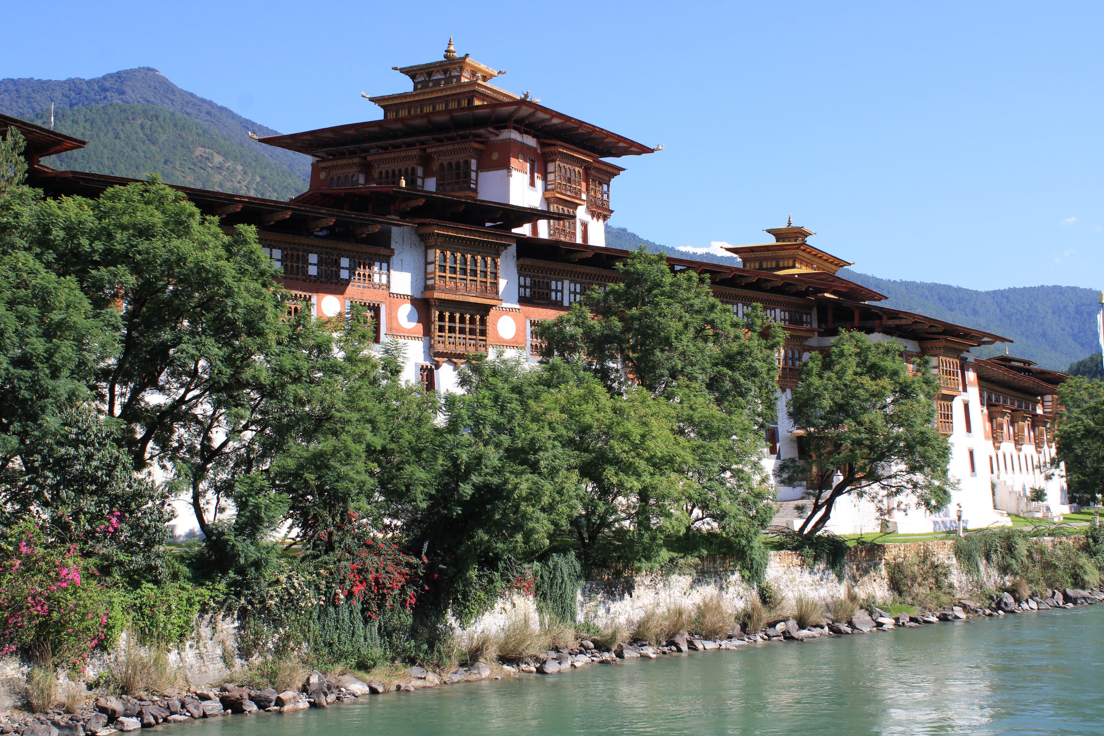
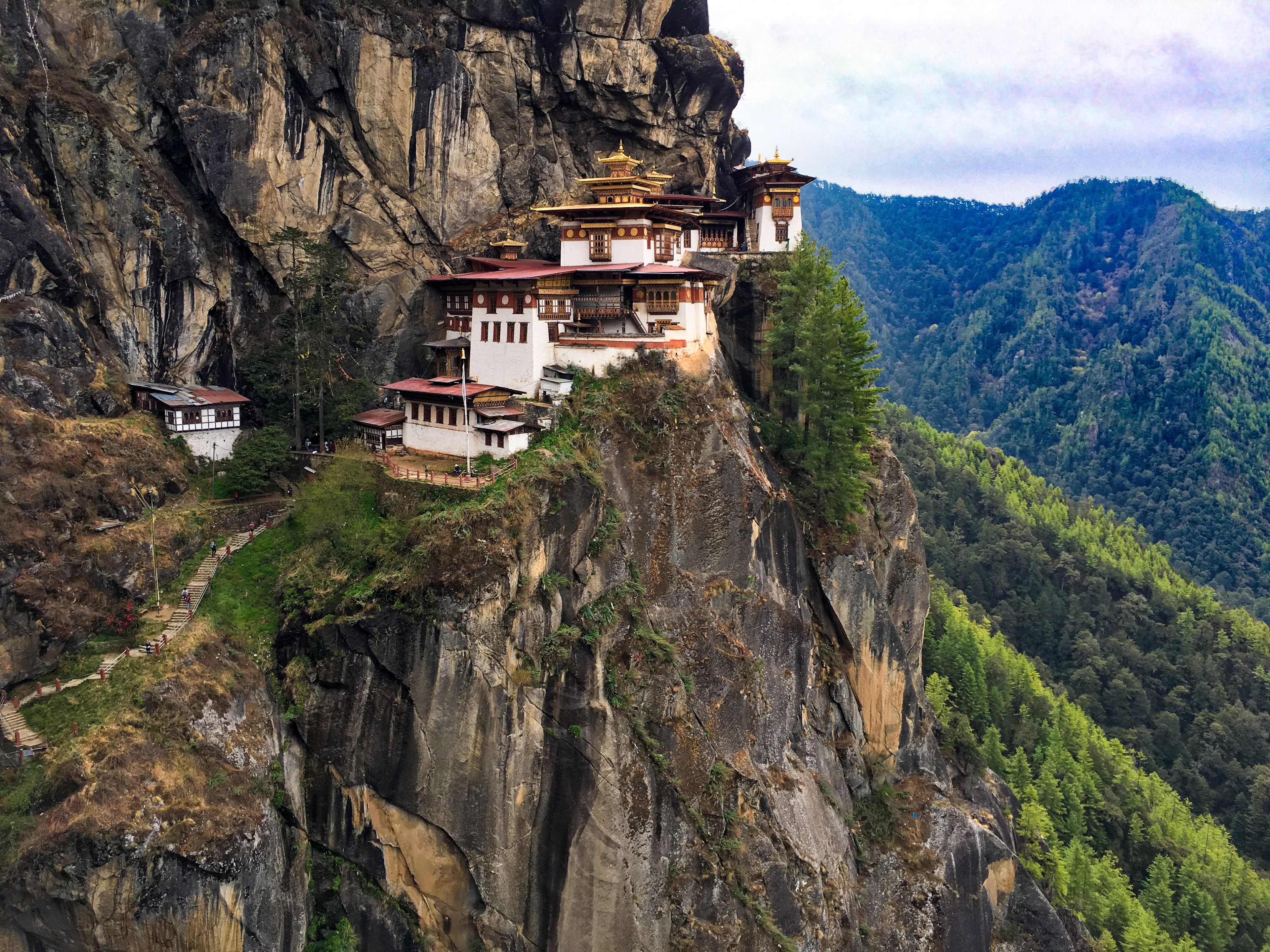
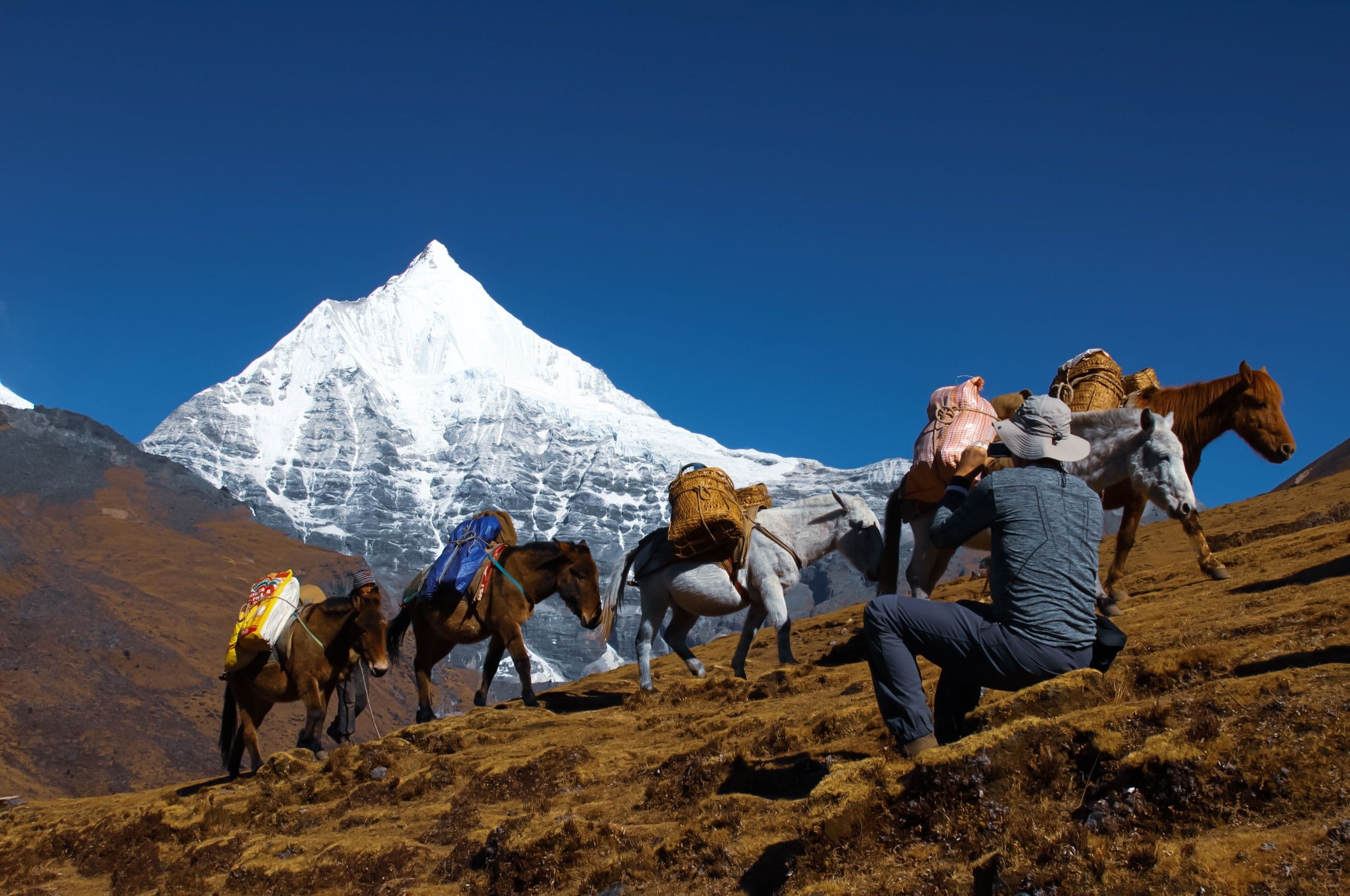
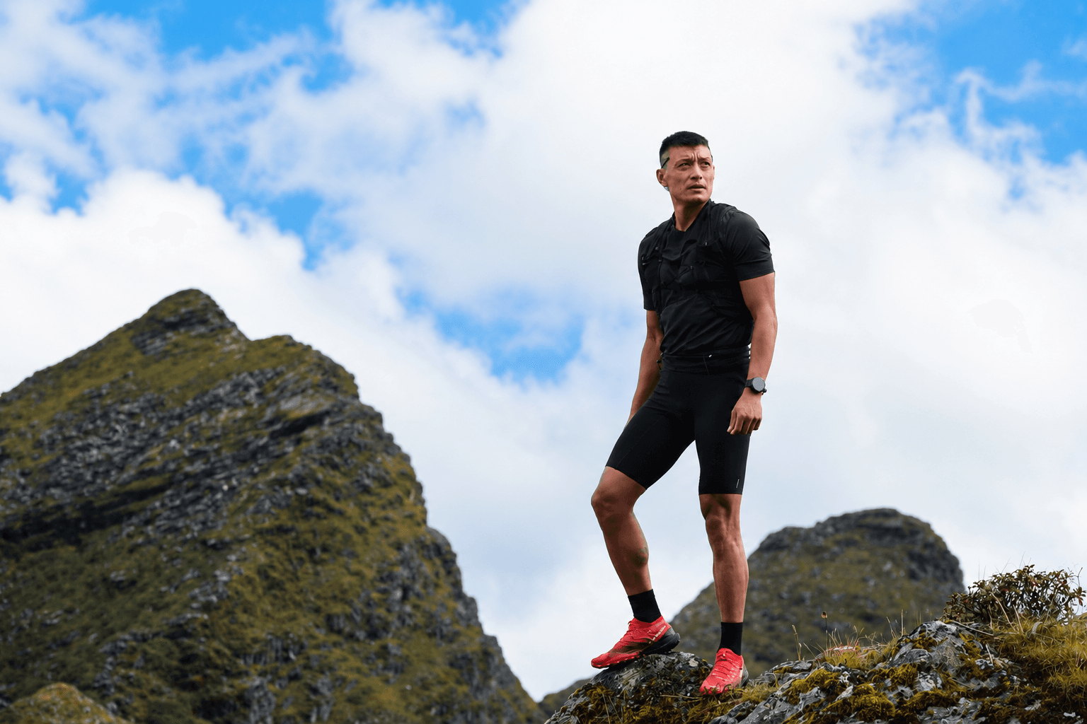
A real, specific Bhutanese scene - a named pass, a real festival, a real guide.
Generic mountain stock that could be any range on earth.
object-cover inside a fixed-aspect frame, cropped deliberately for a banner, portrait, or panel slot.
An uncropped image squeezed into a box, distorting its proportions.
A stand-in photo marked TODO(content) in the config module that owns it, tracked in docs/DEPLOYMENT.md.
A placeholder shipped silently, with nothing noting it needs replacing before launch.
next/image, sourced from next.config.ts's remotePatterns allowlist - every host verified before it ships.
An unverified external URL dropped straight into markup.
One stroke, one hand
Every functional icon comes from lucide-react - stroke-based, sized off a fixed scale, and coloured by the text around it, never a hex of its own.
- Action, forward motion
- Confirmation, a done state
- A contact channel
- A place, an itinerary stop
- Terrain, altitude
- A rating
Trail Hiker
The animated progress marker in the How It Works stepper, walking the timeline as the section scrolls. Drawn in currentColor, same contract as every lucide icon.
WhatsApp Glyph
lucide-react ships no brand icons, so this fills the one real gap - a solid currentColor mark, not an outline recreation of someone else's logo.
lucide-react, and nothing else
Every functional icon on the site comes from the same library - stroke-based, 2px weight, never filled. One consistent hand drew all of them, which is most of why a page full of icons still reads as one system.
A fixed size scale, not one-off numbers
16px for inline meta, 20px for section markers, 24px for nav and header controls, 32px and up for a hero-scale mark. An icon sized outside that scale is a sign the layout needs a different treatment, not a bigger icon.
Colour follows text, never a hex of its own
An icon takes currentColor or a semantic token - text-primary, text-muted-foreground - so it changes with theme and context automatically. A hardcoded fill is the one way an icon can silently break in dark mode.
An icon labels; it never replaces the label
Every icon is aria-hidden and sits beside real text, except the rare icon-only control, which carries an aria-label instead. Nothing on this site communicates through a glyph alone.
A lucide-react icon, aria-hidden, paired with a visible label.
A bare icon with no adjacent text and no aria-label.
A size step from the scale - 16, 20, 24, or 32px and up.
An arbitrary one-off icon size picked to fill a gap.
currentColor or a semantic token, so dark mode follows automatically.
A hardcoded hex fill baked into the icon markup.
A custom SVG mark only for a brand-specific glyph the library doesn't ship - the WhatsApp icon, the trail hiker.
A hand-drawn recreation of an icon lucide already has.
The shapes that repeat
Five structures reused site-wide instead of a card grid - each one a genuine composition, not a restyle of the last.
Banded sections
Full-width bands alternate background/muted/navy down the page, each with its own vertical rhythm - compact, default, or spacious - so no two consecutive sections read the same.
Every page on the site.
The mountain seam
A peak silhouette caps one band and fills with whatever colour comes next, so two bands read as one continuous range instead of a hard edge.
Below the home hero; above every closing CTA.
The hairline spec sheet
A term and its description, separated by a single hairline rule instead of a bordered card - a row reads as one entry in a list, not an object floating in its own box.
Visa steps, packing lists, FAQs, this page's own Foundation section.
The bento tile grid
Solid-fill tiles in a fixed four-colour rotation, sized unevenly so the grid reads as composed rather than uniform. No two adjacent tiles ever share a fill.
Home's WhyChooseUs, About's kingdom stats, this page's Principles.
The mono-numeral sequence
01, 02, 03 in the tracked mono label voice, not a bullet or an icon - a numbered list that reads as procedure rather than decoration.
Visa's process steps, Travel Essentials' etiquette list.
Bold minimalism, stated as rules
These are the decisions that keep the site from drifting back toward the soft, rounded, shadowed default that every template shares.
Corners are sharp, everywhere
The --radius token is 0, which flattens every rounded-* utility site-wide. Badges, pills, avatars and carousel dots are rectangles. If rounding ever comes back, it comes back by changing that one token.
No shadows, no borders as decoration
Depth comes from solid fills meeting each other, not from a soft edge. Hairline rules are structural dividers, not card outlines - and there is no box-shadow anywhere on the site, focus outlines included.
No glass, no blur, no gradient soup
Frosted panels and soft translucent cards are the house style of every template. Surfaces here are opaque and definite.
Lift is movement, not glow
An interactive element rises half a step or shifts its fill on hover. It never gains a halo, a ring or a drop shadow.
No two neighbours share a layout
Consecutive sections use different idioms - editorial list, typographic index, mosaic, pinned trail, split panel - so a page reads as a sequence rather than a repeated card grid.
Sections alternate and breathe unevenly
Bands step between background, muted and navy, and vertical space steps between compact, default and spacious. Uniform rhythm top to bottom is the tell we design against.
Decisive, never bouncy
Motion clarifies; it never decorates. Every animation answers one of three questions - where did this come from, what changed, is the system working. If it answers none, it is cut. Timings are tokens, never a literal at the call site.
Easing
Hover a row to run it
ease-enter
cubic-bezier(0, 0, 0.2, 1)
Arriving: decelerate in. Reveals, panels, page entrances.
ease-exit
cubic-bezier(0.4, 0, 1, 1)
Leaving: accelerate away.
ease-standard
cubic-bezier(0.4, 0, 0.2, 1)
Moving within the page. Hover, press and state flips.
Duration
duration-press
60ms
Pointer-down. Has to beat perception.
duration-instant
120ms
Colour and state flips: hover, active, focus.
duration-quick
220ms
Small transforms: arrows, icons, badges.
duration-settle
380ms
Entrances: reveals, panels, page enter.
duration-stage
520ms
The largest moment on a page. Used sparingly.
- Transform and opacity only
- Those two stay on the compositor. Width, height, top, left, filter and box-shadow force layout or paint, and are never animated.
- Four states, every control
- Rest, hover fill shift, press, focus-visible outline. Press is CSS :active, inverts the hover lift, and goes in faster than it comes out - physical controls resist quickly and return slowly.
- Motion is additive, never load-bearing
- Every page is complete and readable with no JavaScript, no scroll-driven animation support, and reduced motion on. Nothing is ever hidden waiting for a script to arrive.
- Nothing bounces
- No spring, overshoot or elastic easing, and no parallax, cursor followers, typewriter text or ripples. Sharp corners and rubber motion tell two different stories.
A guide talking, not a brochure
The writing carries as much of the brand as the palette does - and it is the part that most often slips first.
Specific over superlative
A named pass, an altitude, a month. Detail is what makes a trip sound real; adjectives are what make it sound like every other operator.
Honest about the hard parts
If a trek is long, cold or high, the copy says so before the booking does. Managing expectations is the service.
Unhurried
No countdowns, no scarcity, no exclamation marks. The reader is planning a trip months out and can be trusted with the time.
Plain words, full sentences
Write the way a guide talks on the trail. No industry shorthand, no stacked marketing fragments.
Eleven days, two passes above 4,000m, and three nights under canvas.
An unforgettable journey of a lifetime!
Spring and autumn are the two clear windows. Summer is green, wet and quiet.
Bhutan is amazing all year round!
Tell us your dates and we'll send a first-draft itinerary, as soon as we can.
Book now - limited spots remaining!
Every visitor needs a visa arranged through a licensed operator. Here is exactly how it works.
We handle all the boring paperwork so you don't have to worry about a thing.
Where each of these actually lives
Change a value in the file that owns it and the whole site follows. Change it anywhere else and the two drift apart for good.
- src/app/globals.css
- Every colour token, the type scale, --radius, and the motion easings and durations.
- src/config/site.ts
- Name, tagline, description, URL and contact details. No brand string is hardcoded anywhere else.
- src/components/svgs/logo.tsx
- The mark's path data - and by extension the favicon and app icons exported from it.
- src/app/layout.tsx
- The three typefaces, loaded through next/font and exposed as CSS variables.
- docs/STANDARDS.md
- The enforceable version of this page, plus accessibility, SEO, performance and security rules.
Your Bhutan, Your way
Tell us what draws you to the Himalayas and we'll build an itinerary around it - no templates, no pressure.
Request a custom itinerary